We set out to discover the obstacles in the visitor’s journey and clear a path to purpose.
We launched a cleaner, clearer website architecture and saw a 20% increase in web traffic and a 15% increase in conversions.
Project overview & background
Client: USAC Transportation Safety Division (TSD), Transportation & Electronics Business Group (TEBG), 3M
Timeline: June – December 2022
Skills used: site mapping, wireframing, Microsoft Axure, data analysis, project management
Team & roles
Project manager
Integrated marketing & communications
UX / Customer experience
Search strategy
Marketing analytics
Digital asset production (2)
Activation marketing
Production application support
Customer experience analyst
Research & analysis
We evaluated user-submitted feedback and analytics and identified pain points that customers were facing in their journey to learn about and purchase products.
We also reviewed each page for keyword relevance and created a keyword strategy to improve our organic search experience.
Site mapping & wireframing
Based on our research findings, we created a sitemap outlining a proposed information architecture redesign and created a prototype of each page within the website.
Our aim was to simplify the architecture and clarify the intent of each page, making it easier for customers to navigate the site and get to their goal.
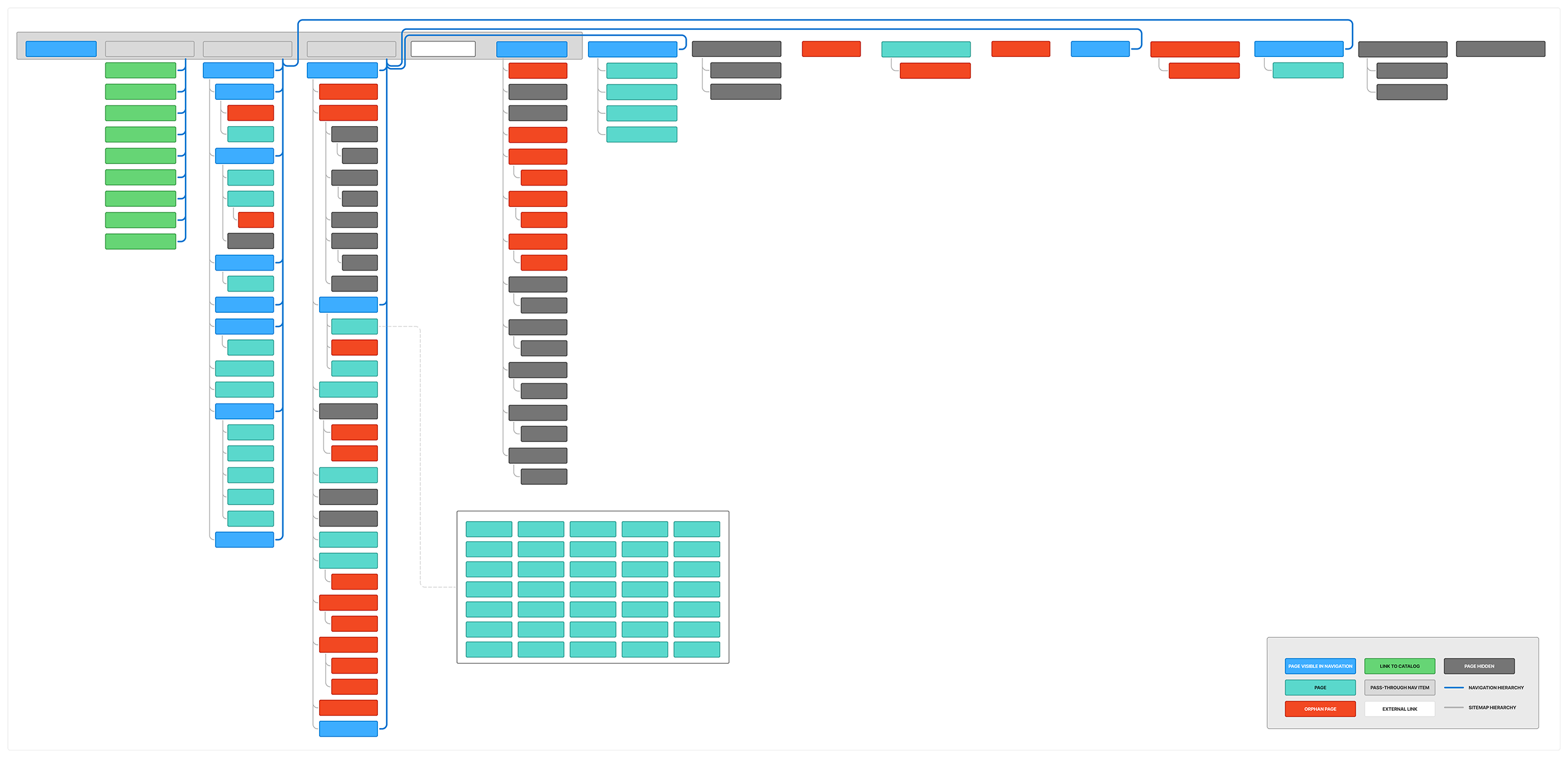
Site map: before
When I completed the initial sitemap inventory, we discovered 98 total pages excluding dynamically generated blog posts and links to catalog pages. Of those 98:
16 appeared in the navigation
27 were orphans (had no internal links)
31 were excluded (represented in the sitemap but not live)
I also discovered that the navigation hierarchy and the site hierarchy did not align. In order for the site to perform its best in Google, we needed to align the two.
Click to enlarge
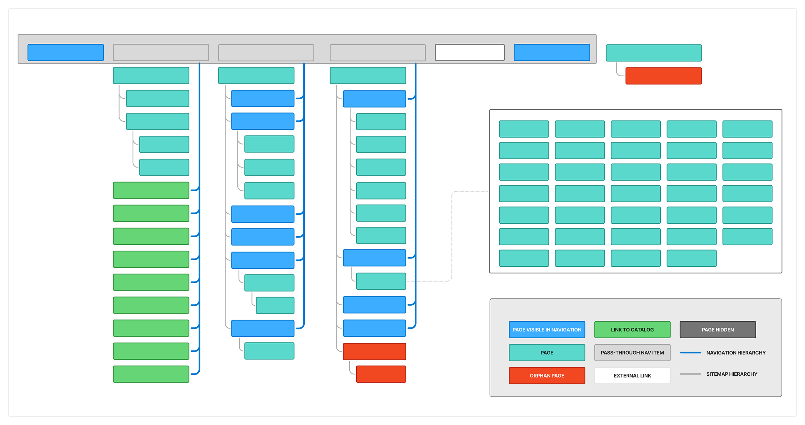
Site map: after
The new site map contained on 36 pages:
12 appeared in the navigation
3 were intentional orphans
0 excluded
Best of all, the site architecture and navigation structure were in alignment.
Click to enlarge
Implementation
We implemented the redesigned pages for both the master base website and for the US, allowing other areas within the global organization to use the new architecture as desired.
We continued to monitor our site health and analytics to identify further areas of improvement and gather additional information about how our users want to encounter our site.
Results
The user experience overhaul resulted in a 20% increase in website traffic and a 15% increase in conversions. Customers were able to find products faster and had a better overall experience on the website.
My key contributions:
Created sitemaps to reflect existing site architecture and proposed updated architecture
Designed wireframes to simplify the page architecture and improve user experience
Facilitated review meetings with business stakeholders to ensure business goals were met
Managed implementation of the redesigned website for the global base website & the US
Monitored user behavior and made further improvements to the website based on feedback & site health tools
This project showcases my skills in user experience design, research, and analysis. I am confident that the skills I developed while working on this project will enable me to create similar successful solutions for other websites.